Visibility of System Status (Nielsen #1)
Icon-only sidebar with active-state highlighting communicates current location without consuming horizontal space in a data-dense layout.
Pre-Attentive Processing (Healey, 1996)
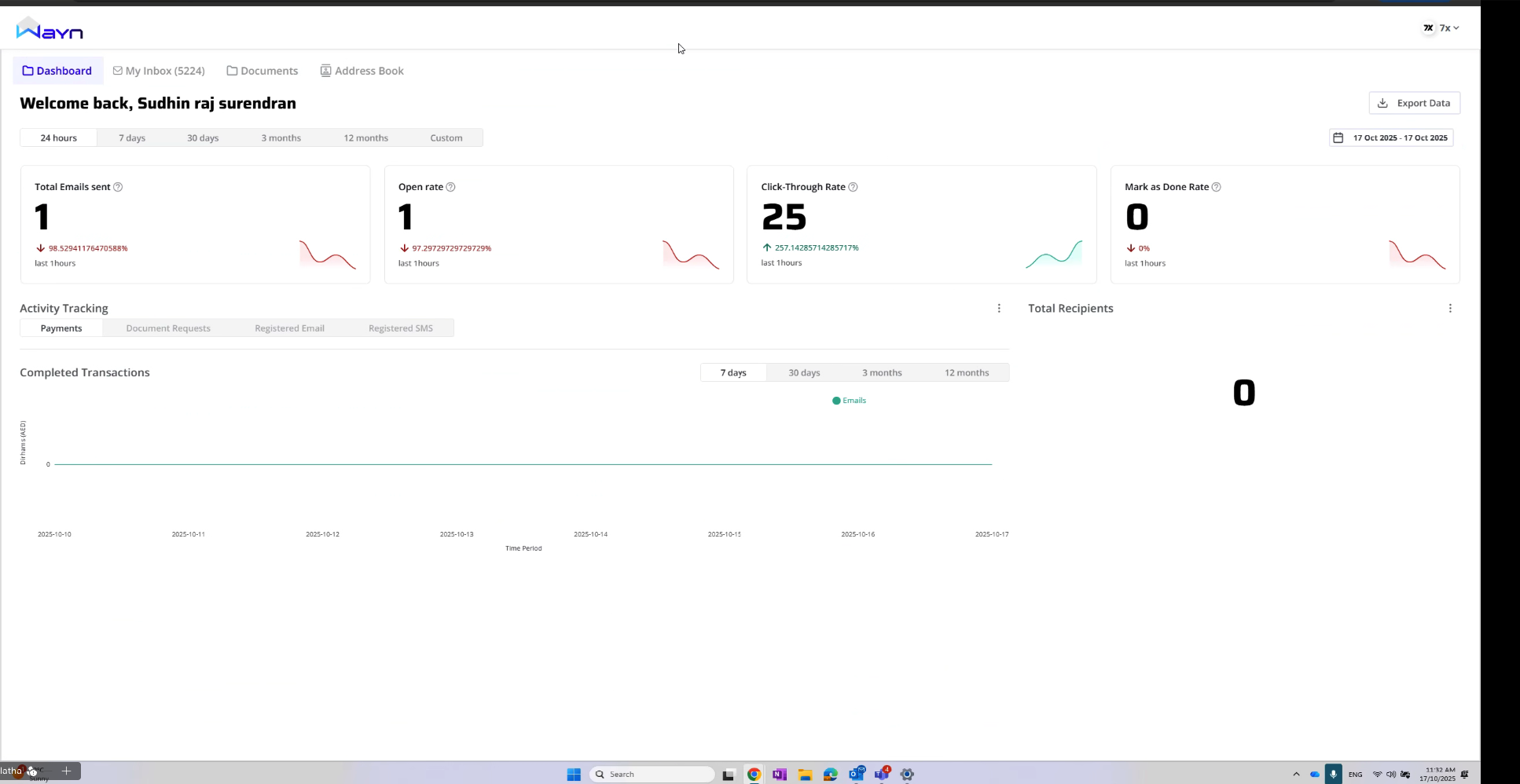
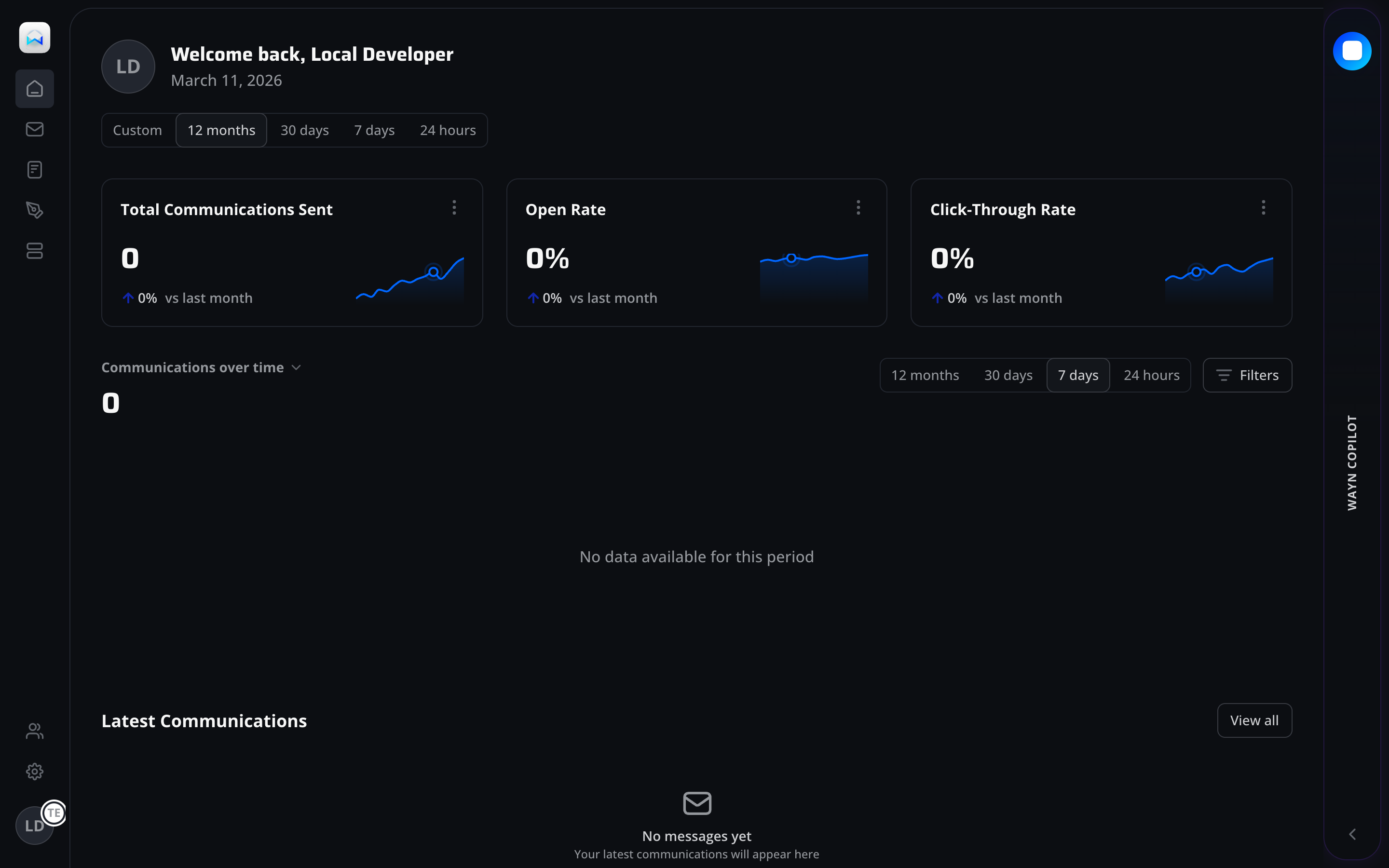
Sparkline charts inside KPI cards enable rapid trend perception before conscious analysis. Users detect upward/downward patterns in under 200ms through pre-attentive visual channels.
Recognition over Recall (Nielsen #6)
Time period selectors (24h, 7d, 30d, 12m, Custom) eliminate the need to remember date ranges. Chunked segmented controls map to natural business reporting cycles.
Progressive Disclosure
Overflow menus on each KPI card hide secondary actions (export, configure) to keep the default view clean while maintaining power-user access paths.
Collapsed Sidebar Navigation
Icon-only sidebar maximizes content area for data visualization. The collapsed default prioritizes dashboard density over wayfinding, appropriate for a daily-use analytics view.
Metric Cards with Inline Trends
Combining absolute values with relative delta and sparkline in a single card eliminates context-switching. Three-card grid follows the F-pattern reading flow common in LTR business dashboards.
Segmented Time Controls
Pill-style segmented control for time ranges provides immediate feedback on selection. Pre-set ranges (24h through 12m) cover 95% of reporting needs, with Custom as an escape hatch.
Filter and View Controls
Positioned top-right following the Gutenberg terminal area, filters are discoverable but subordinate to the primary chart content. Filter icon uses industry-standard funnel affordance.
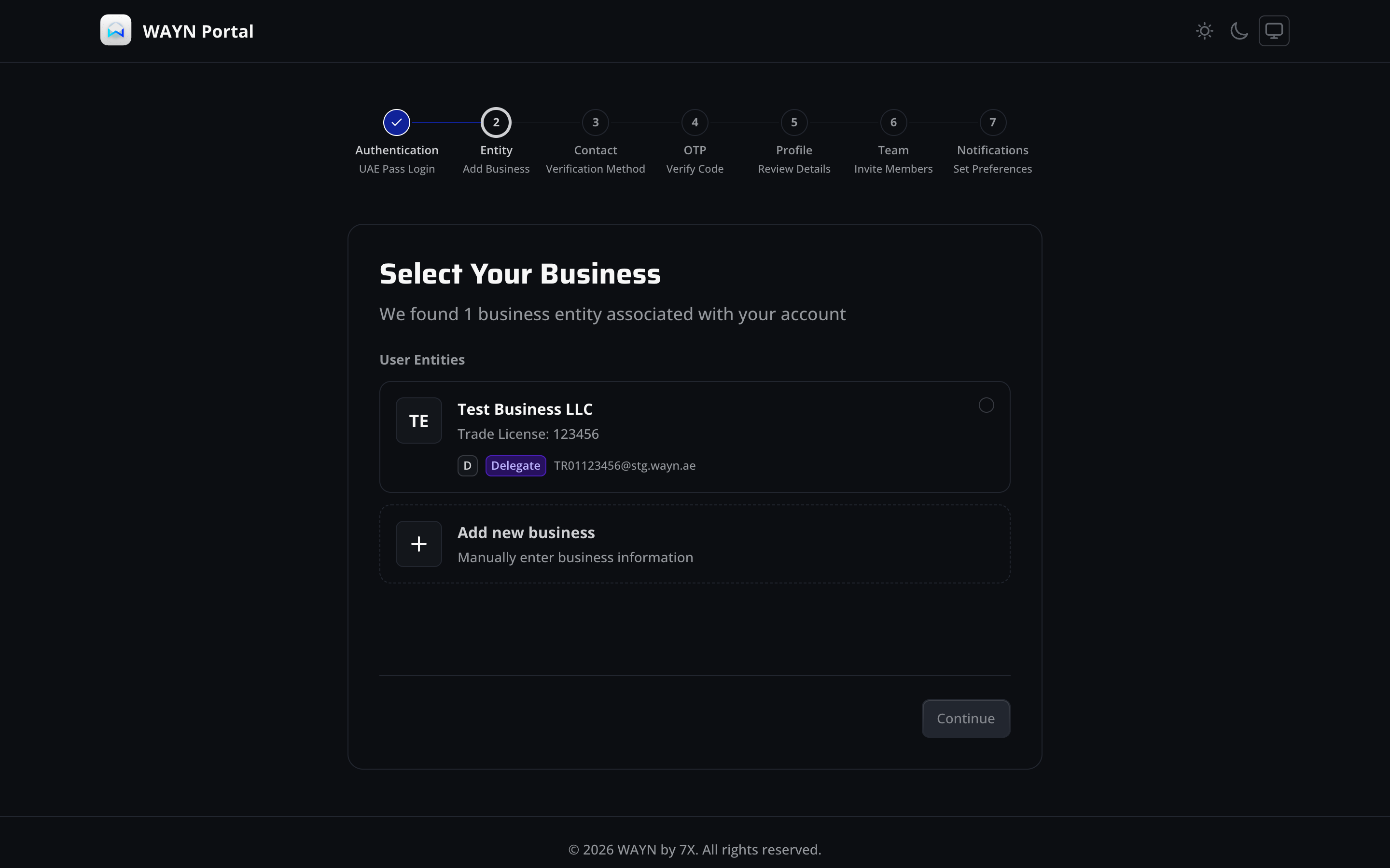
Endowed Progress Effect (Nunes & Dreze, 2006)
The 7-step stepper shows step 1 as complete and step 2 as active, giving new users a sense of progress before they've started the core flow. This artifice increases completion rates by up to 20%.
Principle of Least Effort (Zipf)
Pre-populated entity data from UAE Pass eliminates manual entry. The system retrieves trade license and associated entities, reducing form friction from 7+ fields to a single selection.
Gestalt Law of Proximity
Entity cards group related information (name, license, role badge, email) within a contained card boundary, creating a clear visual hierarchy between distinct business entities.
Multi-Step Wizard Pattern
Breaking KYB into 7 discrete steps (Auth, Entity, Contact, Verification, OTP, Review, Team, Notifications) prevents cognitive overload. Each step focuses on one category of information.
UAE Pass Integration
Entity selection is pre-populated from UAE Pass identity data. This reduces abandonment by eliminating the need to locate trade license numbers and avoids data entry errors.
Role Badge Disambiguation
Delegate badge inline with entity data signals role-based access before the user commits. This prevents confusion about permissions and sets expectations for the portal experience.
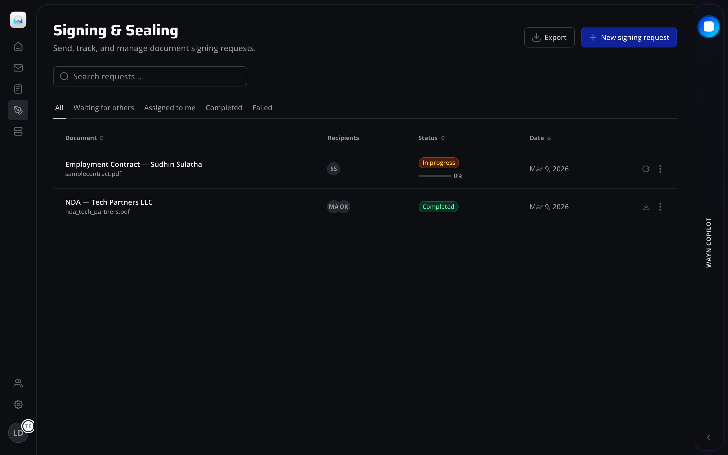
Visibility of System Status (Nielsen #1)
Page header with descriptive subtitle establishes clear context. Users immediately understand this is the document signing hub without needing to parse table content first.
Flexibility and Efficiency (Nielsen #7)
Tab-based filtering (All, Waiting for others, Assigned to me, Completed, Failed) provides direct access to common workflow states. Power users can further refine with the search field.
Pre-Attentive Color Coding
Status badges use semantic color mapping: amber for in-progress, green for completed. Color discrimination occurs in under 250ms, enabling rapid triage of large document lists.
Fitts's Law - Primary Action Sizing
The "New signing request" button is oversized relative to secondary actions (Export), anchored to the top-right corner. Its high-contrast blue fill maximizes target acquisition speed for the most frequent action.
Page Header Pattern
Title + subtitle + primary action follows an enterprise SaaS convention (cf. Linear, Notion). Users transferring from other B2B tools find familiar patterns, reducing learning curve (Jakob's Law).
Tab-Based State Filters
Tabs replace a dropdown filter because the 5 states represent distinct workflow stages, not arbitrary values. Users can see item counts per state and switch without losing scroll position.
Progress Indicator on Status
In-progress documents show a progress bar beneath the status badge, providing dual encoding (color + fill level) for completion state. This serves both quick scanning and detailed assessment.
Action Hierarchy
Primary action (New signing request) uses filled blue button; secondary (Export) uses outline style. Row-level actions (refresh, download, more) are icon-only to avoid visual competition with table data.
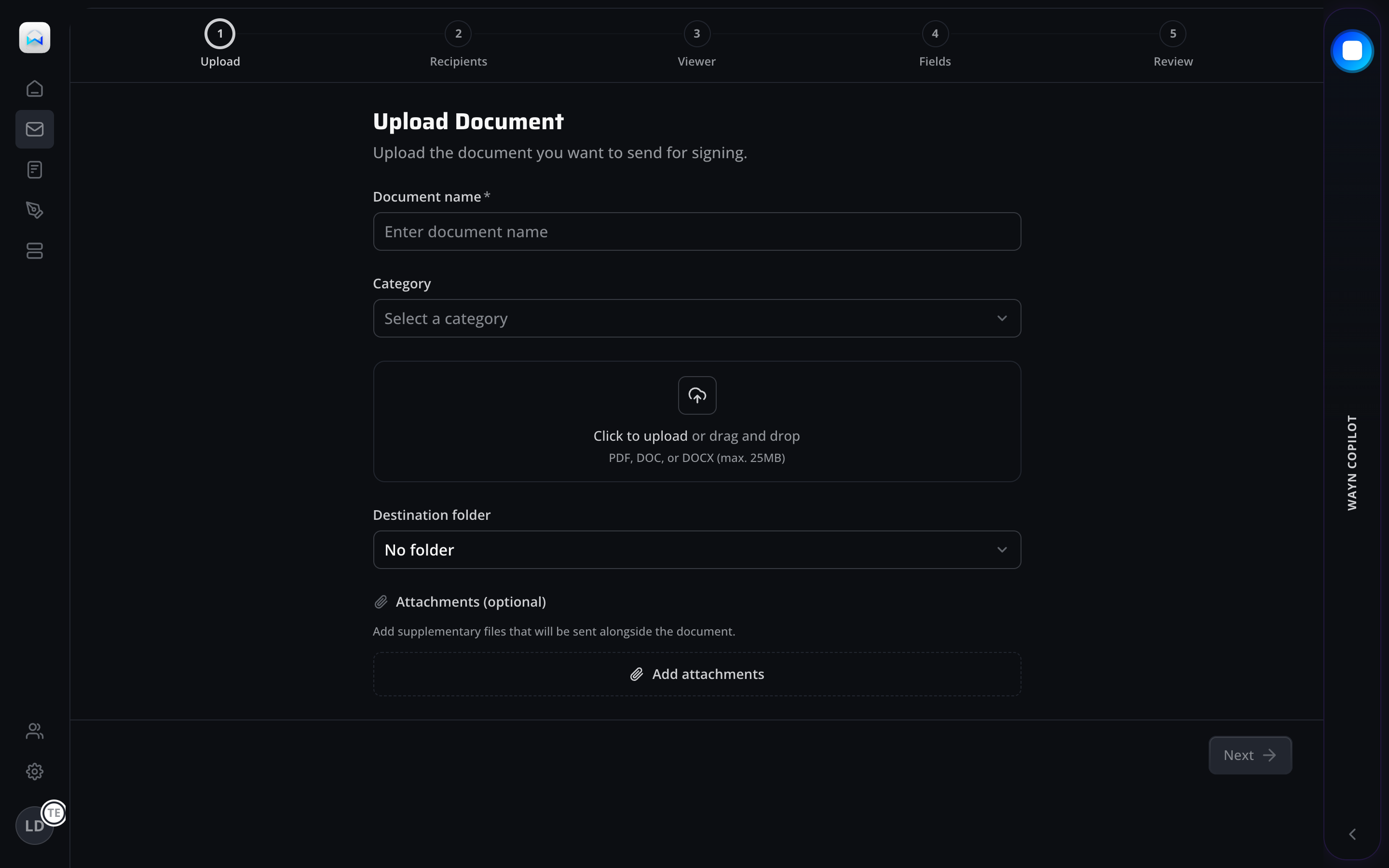
Zeigarnik Effect
The numbered stepper (Upload, Recipients, Viewer, Fields, Review) creates an open loop that the user feels compelled to close. Incomplete steps exert a psychological pull toward completion.
Error Prevention (Nielsen #5)
Required field markers (*) and input constraints (PDF, DOC, DOCX max 25MB) are shown before submission, not after. This prevents errors rather than recovering from them.
Recognition over Recall (Nielsen #6)
Drag-and-drop upload zone with icon + text instructions makes the interaction model visible. Users don't need to recall whether to click, drag, or use a file picker - all are supported.
Aesthetic-Usability Effect (Kurosu & Kashimura)
The step-by-step wizard reduces a complex legal process to a clean, breathable form. The generous whitespace and clear typography make the task feel less intimidating than it is.
Wizard Decomposition
A 5-step wizard breaks down the signing workflow into discrete concerns: document, recipients, viewer permissions, form fields, and review. Each step has a single responsibility.
Form Field Ordering
Fields are ordered by dependency: name first (required for all subsequent steps), then category (affects available templates), then document upload (the core payload), then destination.
Upload Zone Affordance
The dashed border + cloud icon follows a widely established pattern for drag-and-drop targets. File type constraints and size limits are shown inline to prevent upload failures.
Progressive Navigation
Forward-only "Next" button in the bottom-right follows the natural reading terminus. The button is disabled until minimum required fields are met, preventing premature advancement.
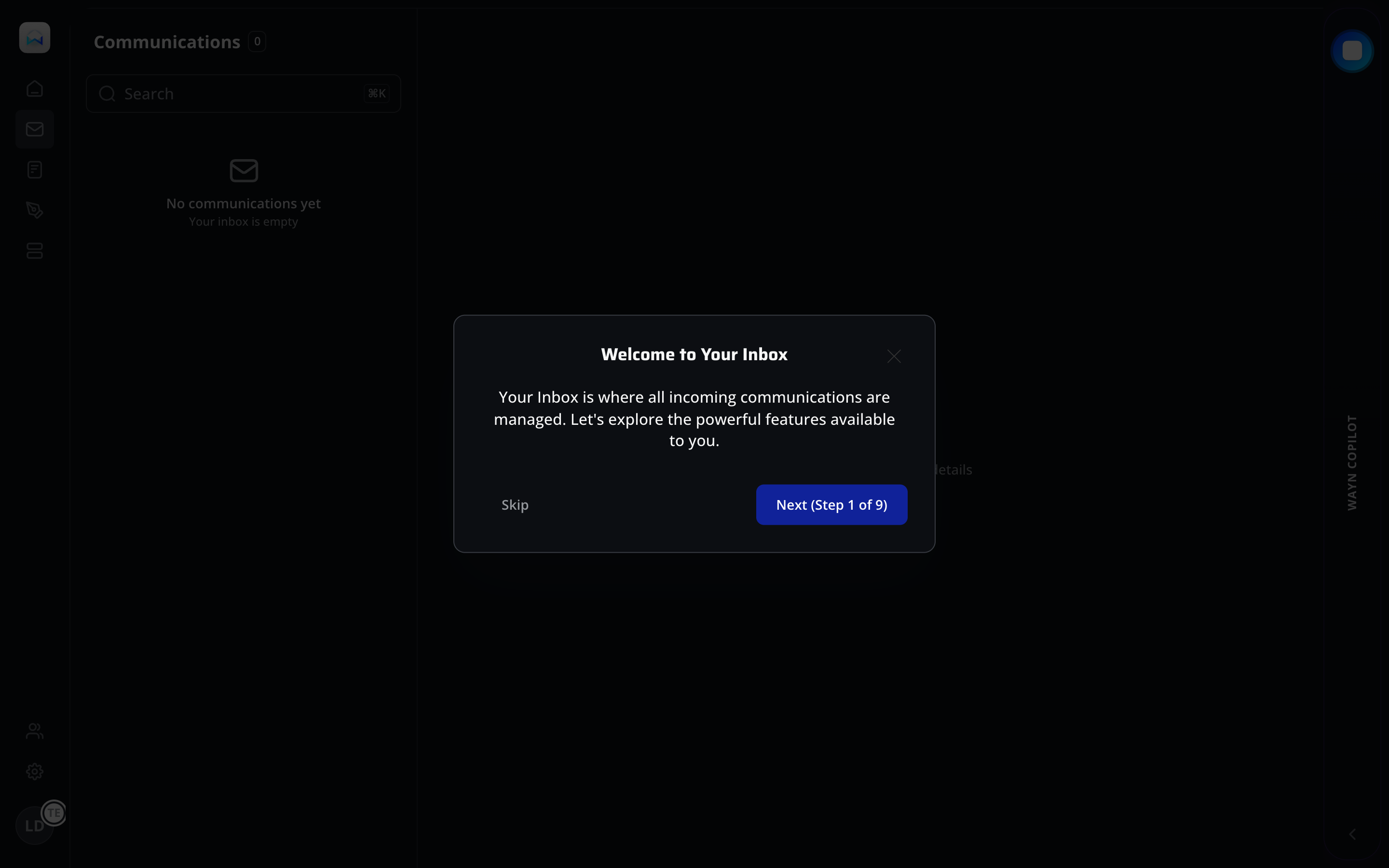
Progressive Disclosure via Guided Tour
A 9-step onboarding tour introduces inbox features incrementally rather than overwhelming new users with the full interface. The modal draws focus to one concept at a time.
User Control and Freedom (Nielsen #3)
The "Skip" option alongside "Next (Step 1 of 9)" respects user autonomy. Experienced users can bypass the tour entirely, while newcomers get structured guidance.
Visibility of System Status (Nielsen #1)
"Step 1 of 9" communicates progress within the tour, setting expectations for time investment and preventing abandonment from perceived unbounded commitment.
First-Run Experience
The modal tour activates only on first visit. It bridges the gap between an empty state and feature discovery, teaching users about inbox capabilities before any data arrives.
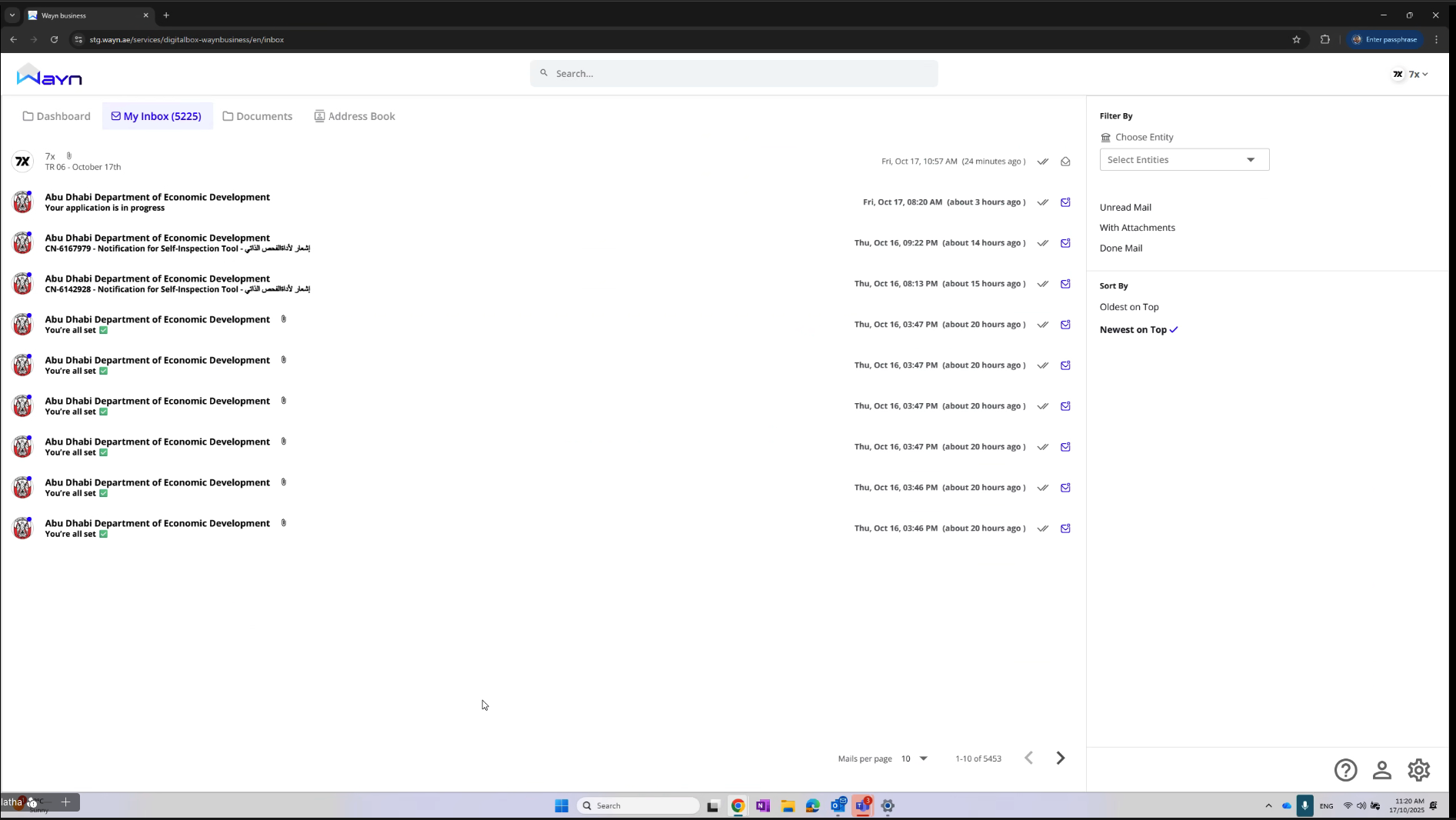
Master-Detail Layout
Split-pane design with a message list on the left and detail panel on the right follows established email client conventions (Outlook, Gmail). Skeleton loading states maintain layout stability.
Keyboard-First Search
The search field shows a keyboard shortcut hint, signaling power-user acceleration. This dual-mode input (click or keyboard shortcut) serves both novice and expert users.
Match Between System and Real World (Nielsen #2)
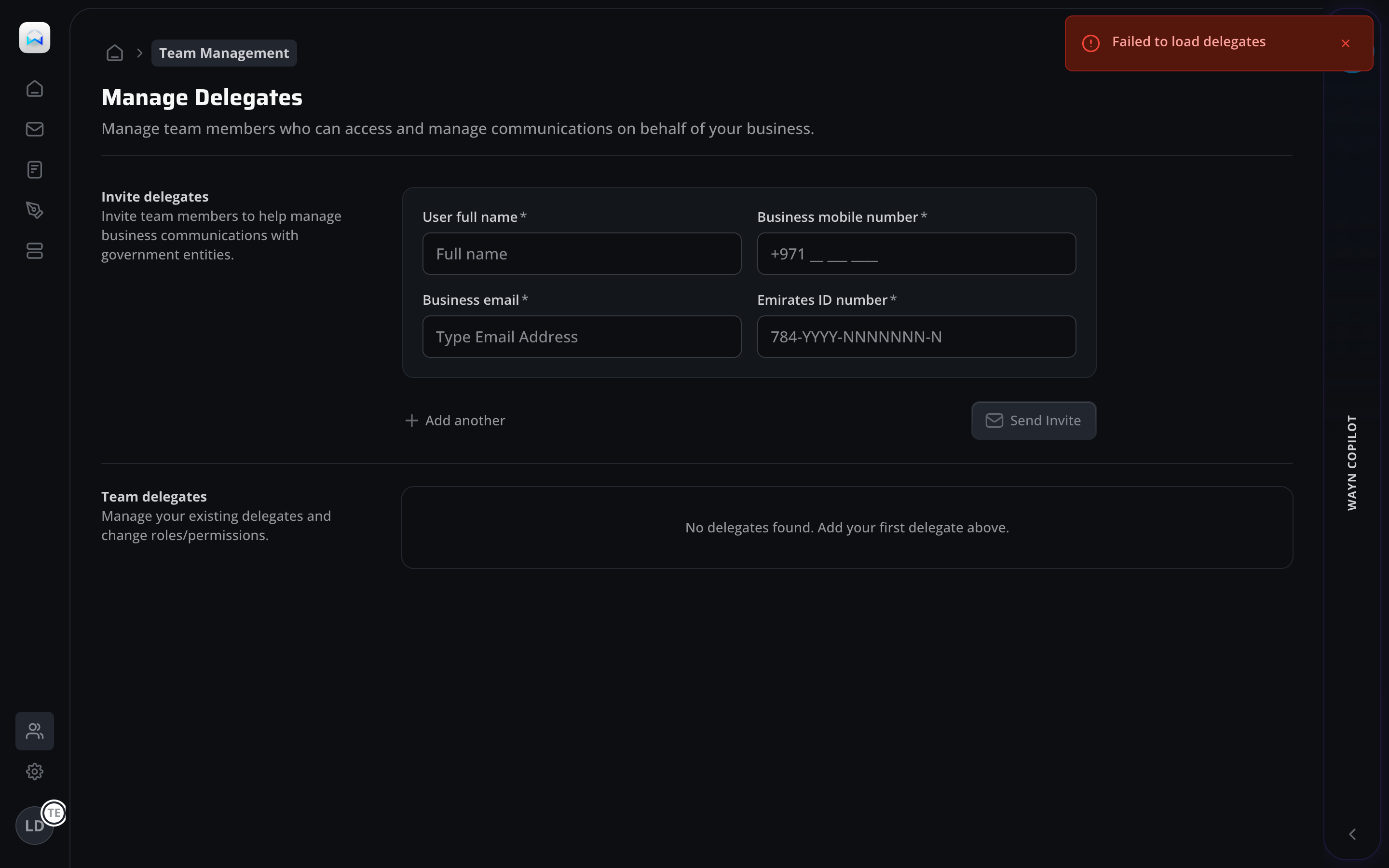
Breadcrumb navigation uses "Team Management" as the domain label, matching the organizational language of UAE businesses rather than technical jargon like "RBAC" or "user provisioning."
Constraint-Based Input (Norman, 1988)
The Emirates ID field uses a format mask (784-YYYY-NNNNNNN-N) that constrains input to valid patterns. This physical constraint prevents malformed IDs without relying on post-submission validation.
Principle of Least Effort
"+ Add another" link allows batch invitations without navigating away. Users inviting multiple team members avoid the repetitive overhead of re-entering the form for each delegate.
Information Scent (Pirolli & Card, 1999)
The section is split into "Invite delegates" (creation) and "Team delegates" (management), providing strong information scent about where to perform each task type.
Breadcrumb Context
Breadcrumbs establish hierarchical context (Home > Team Management) so users can navigate back without using the browser. This is critical for multi-level portal navigation.
UAE-Specific Form Design
Phone number field pre-fills +971 country code; Emirates ID uses the national format mask. These localizations reduce input errors and signal platform awareness of the UAE business environment.
Inline Description Text
Each section includes a brief description beneath the heading, explaining both the action and its business impact ("manage business communications with government entities").
Empty State with Guidance
The "No delegates found" state provides directional copy ("Add your first delegate above"), turning a potentially dead-end state into a call to action.
Recognition over Recall (Nielsen #6)
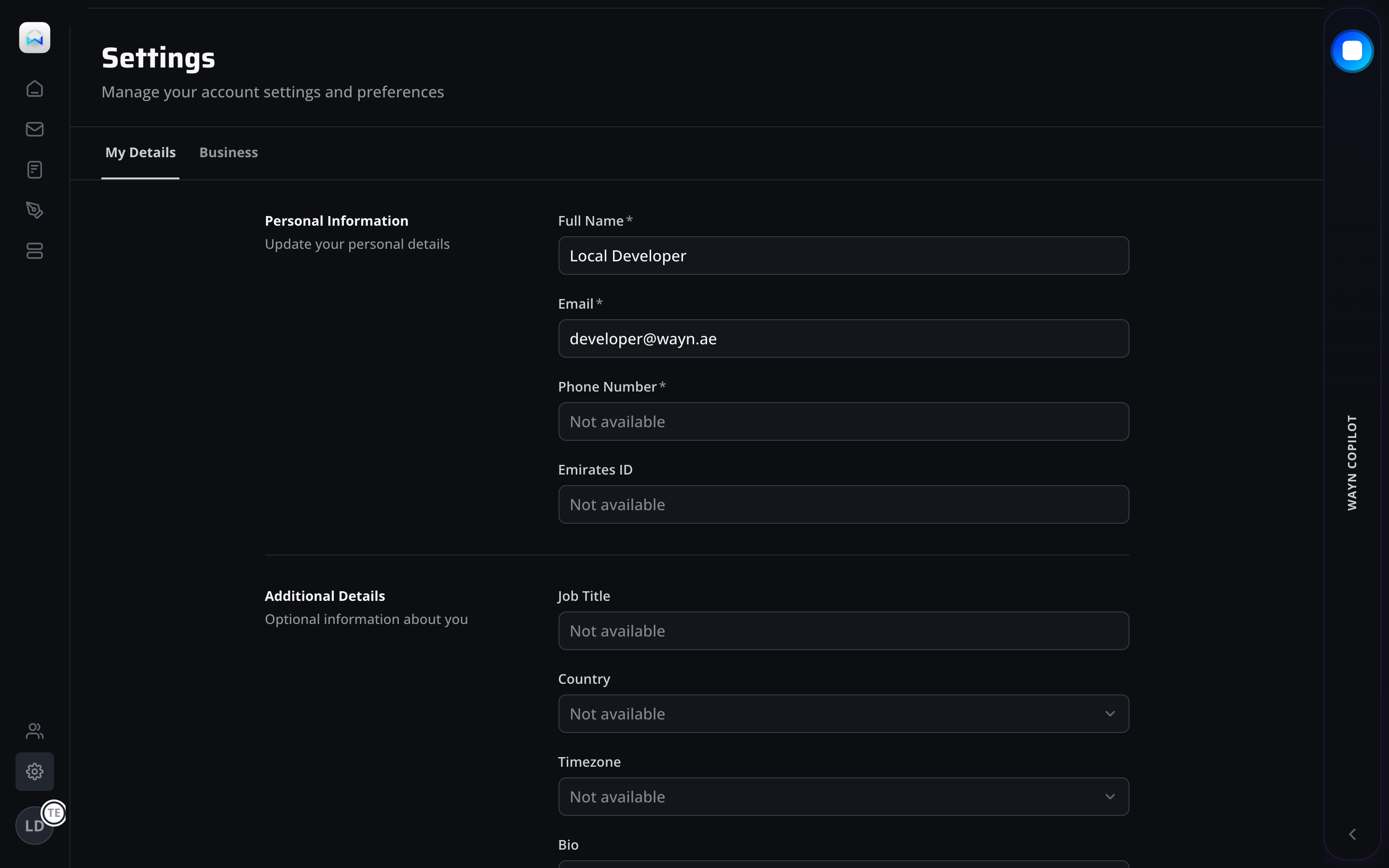
Tab navigation (My Details / Business) surfaces the two primary settings domains. Users don't need to recall section names - they can scan and select from visible options.
Consistency and Standards (Nielsen #4)
Form layout follows a label-left, input-right pattern consistent across all portal forms. Required fields are marked with asterisks following W3C form accessibility guidelines.
Gestalt Law of Common Region
"Personal Information" and "Additional Details" are visually separated by a horizontal rule, creating distinct regions that help users locate the right field group without scanning the entire form.
Two-Tab Architecture
Separating personal details from business settings reflects the delegation model: personal info belongs to the user, while business settings may require owner-level permissions.
Pre-Filled Profile Data
Fields are pre-populated from UAE Pass identity data (name, email). "Not available" placeholders indicate data that the user can optionally provide without suggesting data loss.
Section-Based Form Grouping
Left-aligned section labels ("Personal Information", "Additional Details") with right-aligned input fields create a scannable form layout that scales well as new fields are added.
Fitts's Law - Primary Action Placement
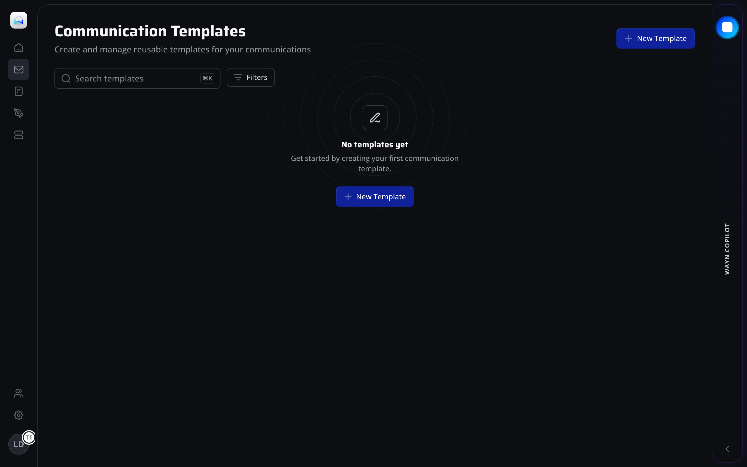
The "New Template" button appears in two locations: page header (top-right) and empty state center. Dual placement minimizes target acquisition distance regardless of where the user's attention lands.
Flexibility and Efficiency (Nielsen #7)
Search field with keyboard shortcut hint plus adjacent filter controls provide layered access paths. Novice users click filters; experts use keyboard shortcuts to reach the same result.
Aesthetic-Usability Effect
The illustrated empty state (pen icon with concentric circles) elevates what would be a blank page into an inviting moment. Users perceive the feature as more polished and trustworthy than a plain text empty state.
Empty State as Onboarding
"Get started by creating your first communication template" turns an empty screen into a guided entry point. The CTA button is the only actionable element, creating a single clear next step.
Search and Filter Toolbar
The persistent toolbar (search + filters) is visible even on the empty state, establishing the UI chrome before data arrives. Users build a mental model of the page's tools early.
Illustrated Empty State
Concentric circle illustration with centered icon maintains visual weight in the page center, preventing the layout from collapsing into a top-heavy header-only view.