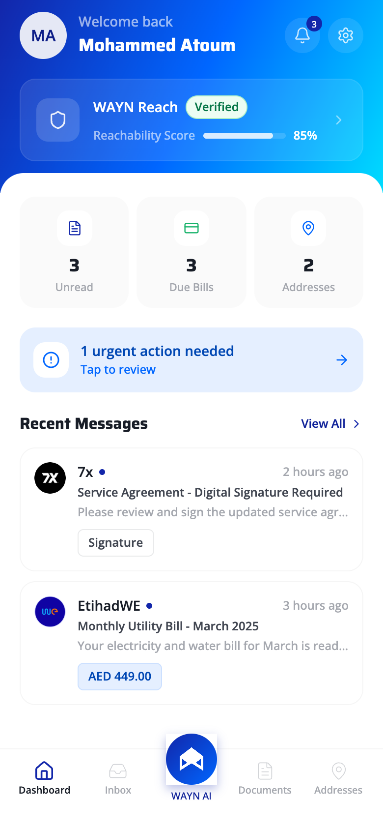
01 - Dashboard
The command center
Figure/ground hierarchy, progressive disclosure, and Fitts's Law converge to create a zero-learning-curve home screen.
Hero Card Layering
The gradient WAYN Reach card lifts off the flat background through color saturation and elevation. Figure/ground separation ensures the primary identity element captures fixation first in the visual scan path.
Layered Information Density
Dashboard surfaces summary metrics (Unread, Due Bills, Addresses) without exposing underlying lists. Users get the signal ("3 unread") without the noise - detail is one tap away, never forced.
Recognition over Recall
The urgent action banner surfaces pending tasks proactively. Users never need to recall what's outstanding - the system externalizes their to-do state, reducing working memory demand to zero.
Target Size Optimization
The AI button is 2x the size of adjacent tab icons, center-positioned in the thumb's natural arc. Fitts's index of difficulty is minimized: large target + short movement distance from resting thumb position.
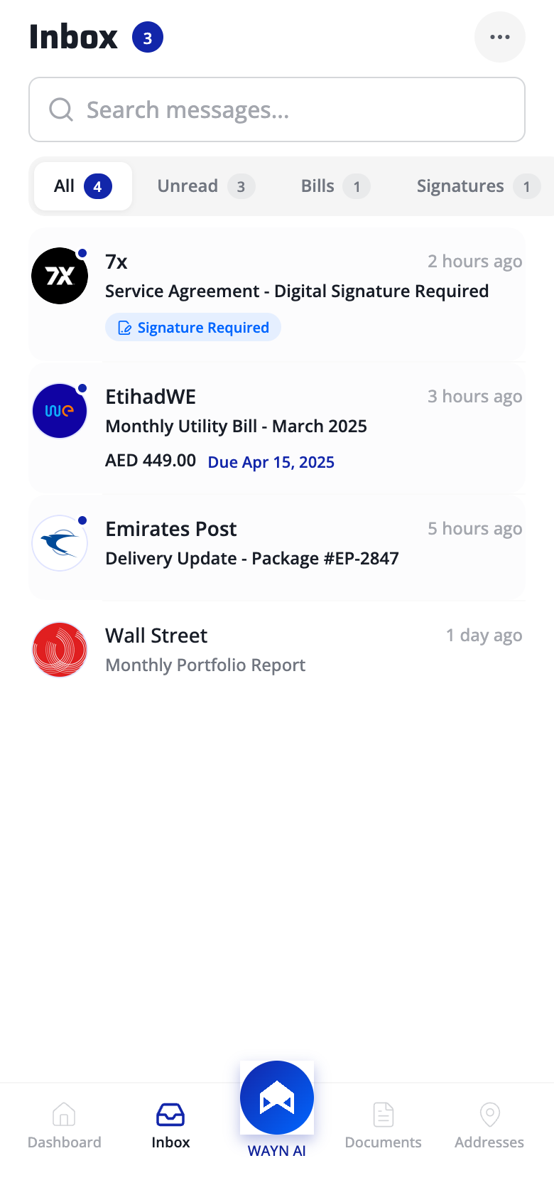
02 - Inbox
Smart mail triage
Hick's Law, pre-attentive color channels, and information foraging theory accelerate scan-to-action time.
Ambient Status Count
The "3" badge renders inbox pressure visible before a single item is read. Continuous status feedback - the system's state is never hidden behind a tap.
Constrained Filter Set
Four filter pills cap the choice set, reducing decision time logarithmically (Hick's Law: RT = a + b*log2(n)). Live counts on each pill convert a scan task into a single-tap selection.
Color-Coded Action Badges
"Signature Required" badges use a distinct color channel (blue on neutral). Pre-attentive color pop-out lets users detect actionable items in under 200ms - faster than conscious reading.
Inline Information Scent
Bill amounts and due dates displayed within the list row follow Pirolli and Card's information foraging theory - strong scent at the summary level eliminates low-value navigation clicks.
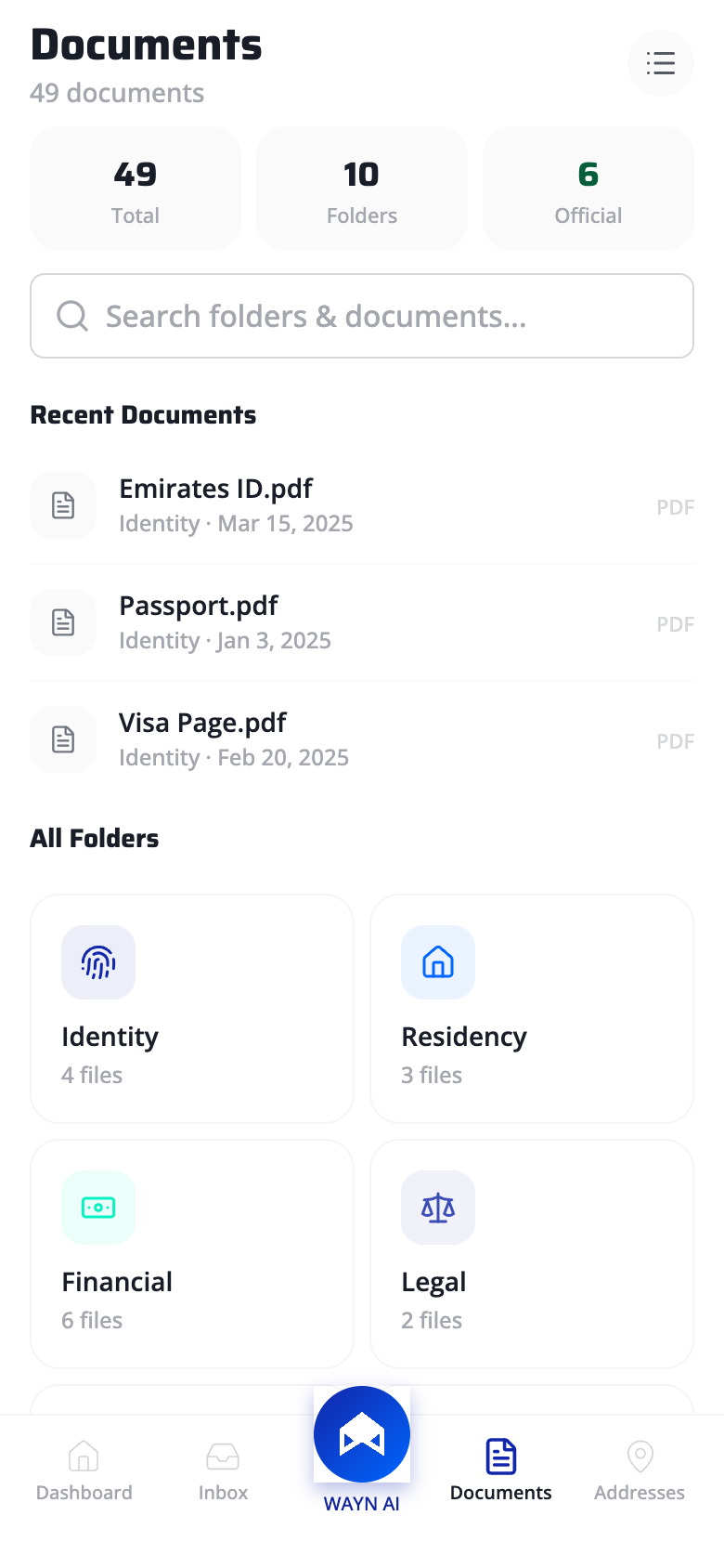
03 - Document Vault
Your digital life, organized
Mental model alignment, the principle of least effort, and Gestalt spatial grouping drive the information architecture.
Mental Model Alignment
Stats bar reads "49 Total / 10 Folders / 6 Official" - language mirrors how users conceptualize a document collection, not how a database structures it. Domain vocabulary over system vocabulary.
Frequency-Based Surfacing
Most-accessed documents (Emirates ID, Passport) get premium placement at the top. Follows Zipf's observation that a small set of items accounts for most retrievals - optimizing the common case reduces average interaction cost.
Categorical Grid Layout
2-column category grid uses proximity (items grouped by domain) and similarity (identical card shapes) to build stable spatial memory. Users learn "Identity is top-left" and navigate by position, not label reading.
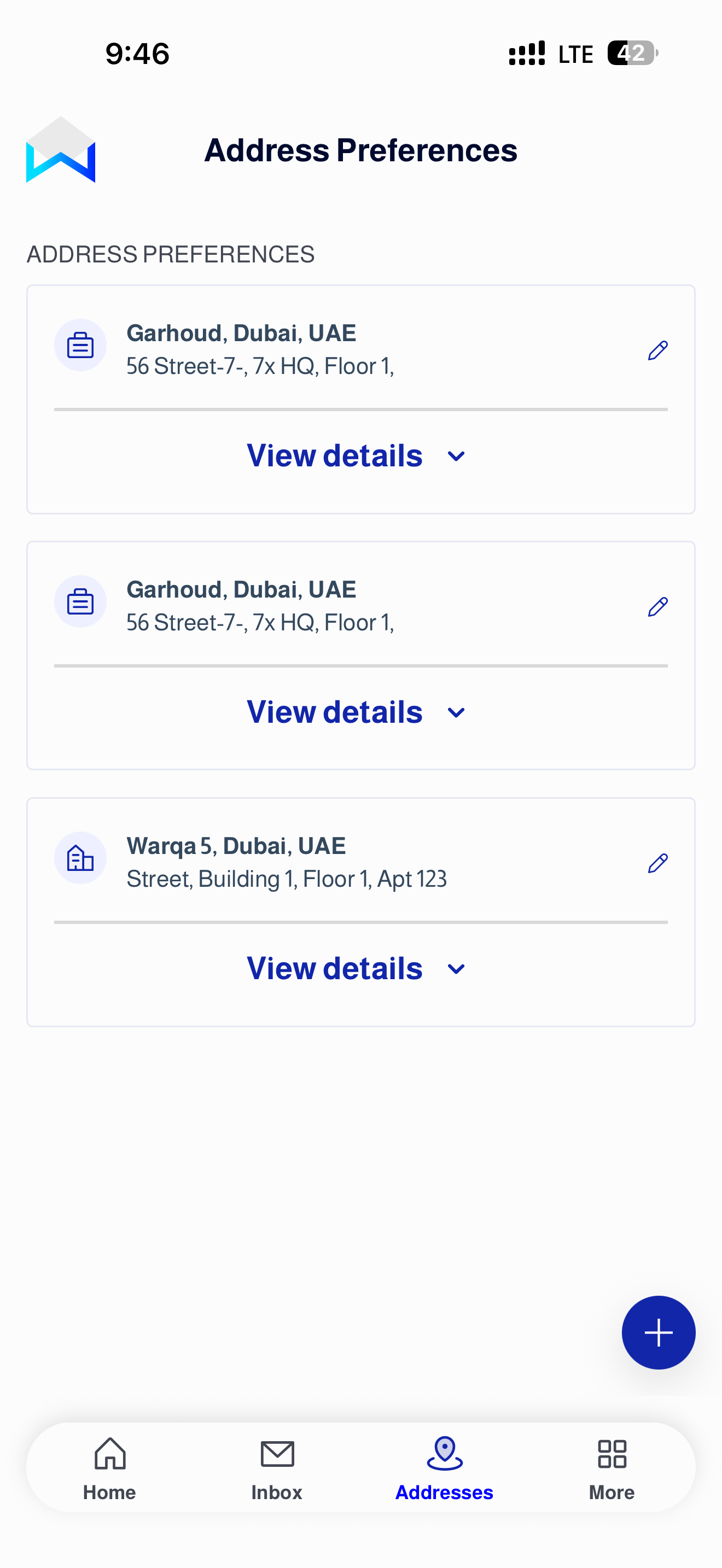
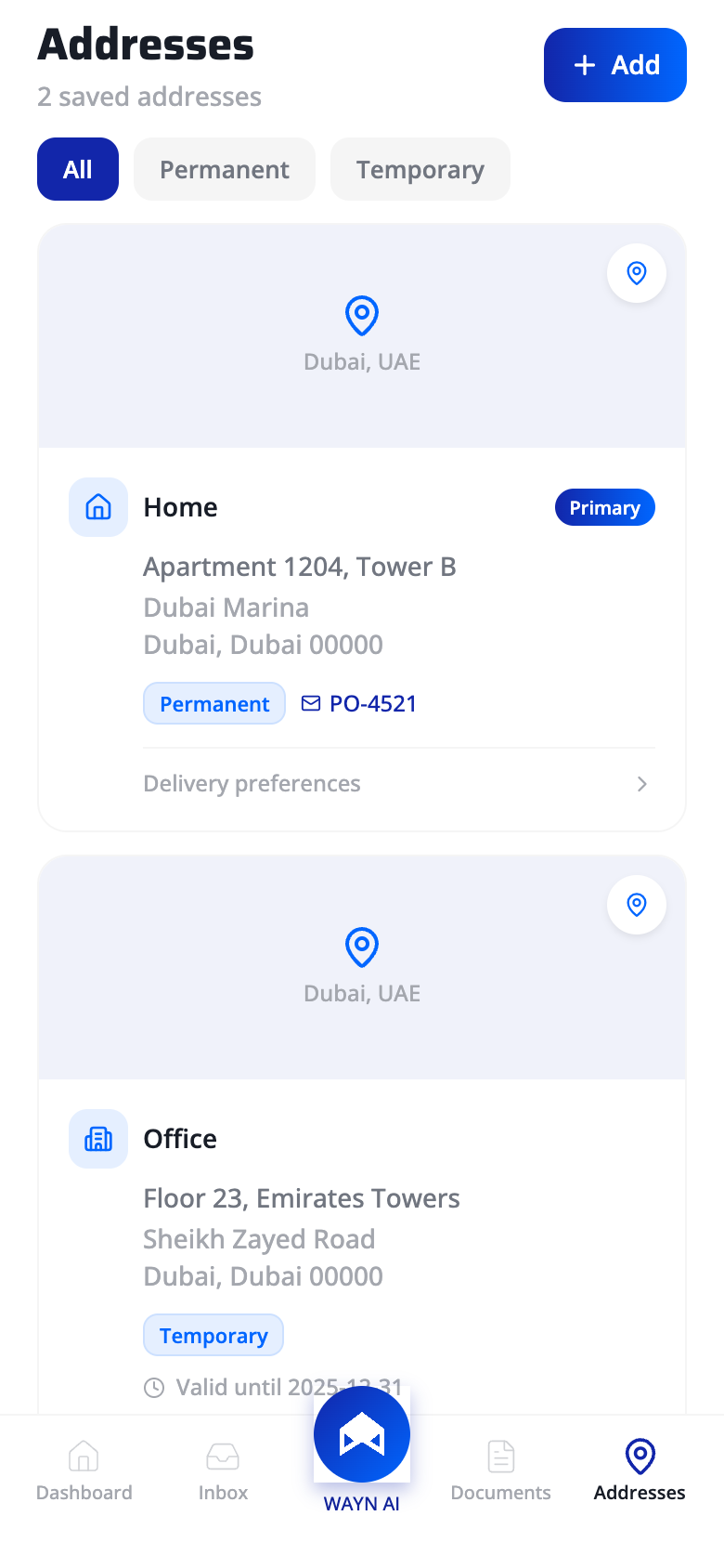
04 - Addresses
Location intelligence
Natural mapping, Fitts's Law, and Gestalt focal point principles make address management intuitive and fast.
Persistent Primary Action
"+ Add" button pinned to the header: fixed position eliminates scroll-to-find cost, and high-contrast fill maximizes target salience. Movement time is minimized for the highest-frequency action on this screen.
Natural Mapping
Map preview at the top of each card creates a direct spatial correspondence between digital record and physical location. Users orient by geography, not by parsing text strings - matching their real-world mental model.
Visual Hierarchy via Badge
"Primary" badge uses color contrast and asymmetric placement to create a focal point. The eye is guided to the default delivery address first - users don't scan all cards with equal effort.
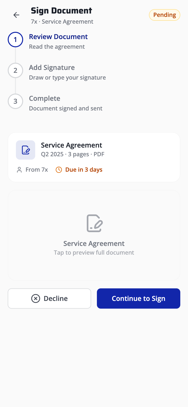
05 - Digital Signatures
Sign with confidence
Error prevention, external memory aids, and the Gutenberg diagram guide users through a high-stakes legal flow.
Step Progress Visibility
Vertical step indicator encodes three states: active (blue), complete (check), pending (gray). Users know their exact position and remaining effort at all times - no ambiguity in a high-anxiety flow.
Persistent Status Badge
"Pending" badge in the header acts as an external memory aid (Scaife and Rogers, 1996) - offloading document state from working memory to the interface. Users never need to recall where they left off.
Deadline as Error Prevention
"Due in 3 days" prevents the slip of missing a deadline before the consequence occurs. Error prevention over error recovery - the system warns at the decision point, not after expiry.
Terminal Area CTA Placement
Primary CTA (Continue to Sign) sits in the Gutenberg diagram's terminal area (bottom-right). Solid fill vs outlined secondary creates a 4:1 visual weight ratio - the safe path is unmistakable.
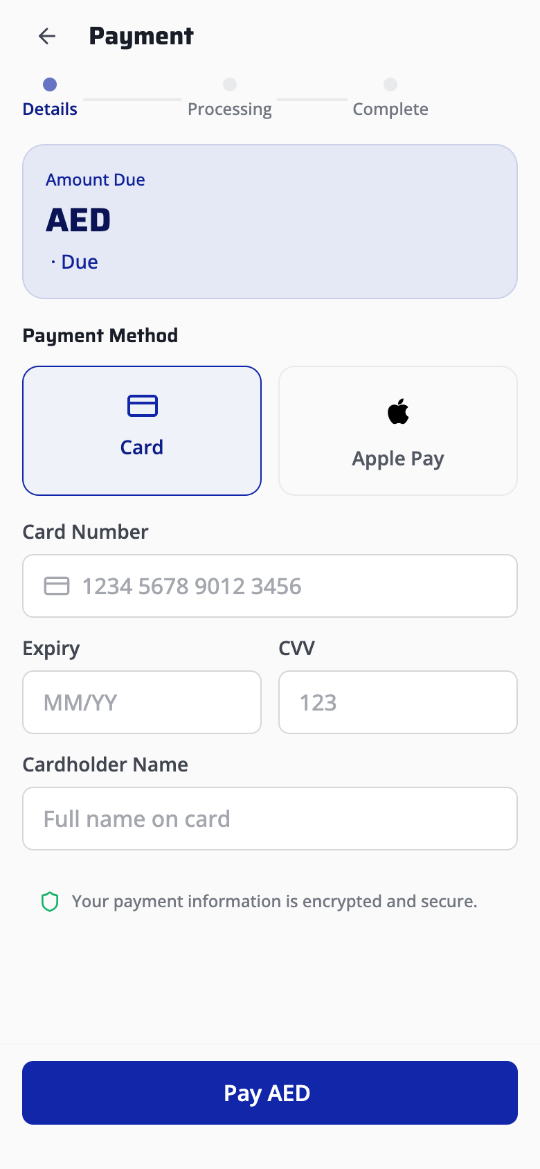
06 - Bill Payment
Frictionless checkout
Visibility of system status, figure/ground hierarchy, and trust-barrier reduction patterns create a confident payment experience.
Journey Transparency
3-step stepper (Details / Processing / Complete) maps the entire transaction lifecycle. Users see where they are, what just happened, and what's next - critical for high-stakes financial flows.
Amount Prominence
Bill amount rendered in large bold type on a raised card creates strong figure/ground separation. The most critical data point passes the squint test - readable at arm's length, scannable in under 300ms.
Method Flexibility
Card vs Apple Pay as equal-weight tiles: neither method is privileged. Expert users switch in one tap; novices discover both options without drilling into menus. Flexibility without added complexity.
Security Signal at Commit Point
"Encrypted and secure" placed directly above the pay CTA follows Fogg's behavior model - reducing anxiety at the exact moment motivation must overcome friction. Trust signals timed to the decision point, not buried in settings.
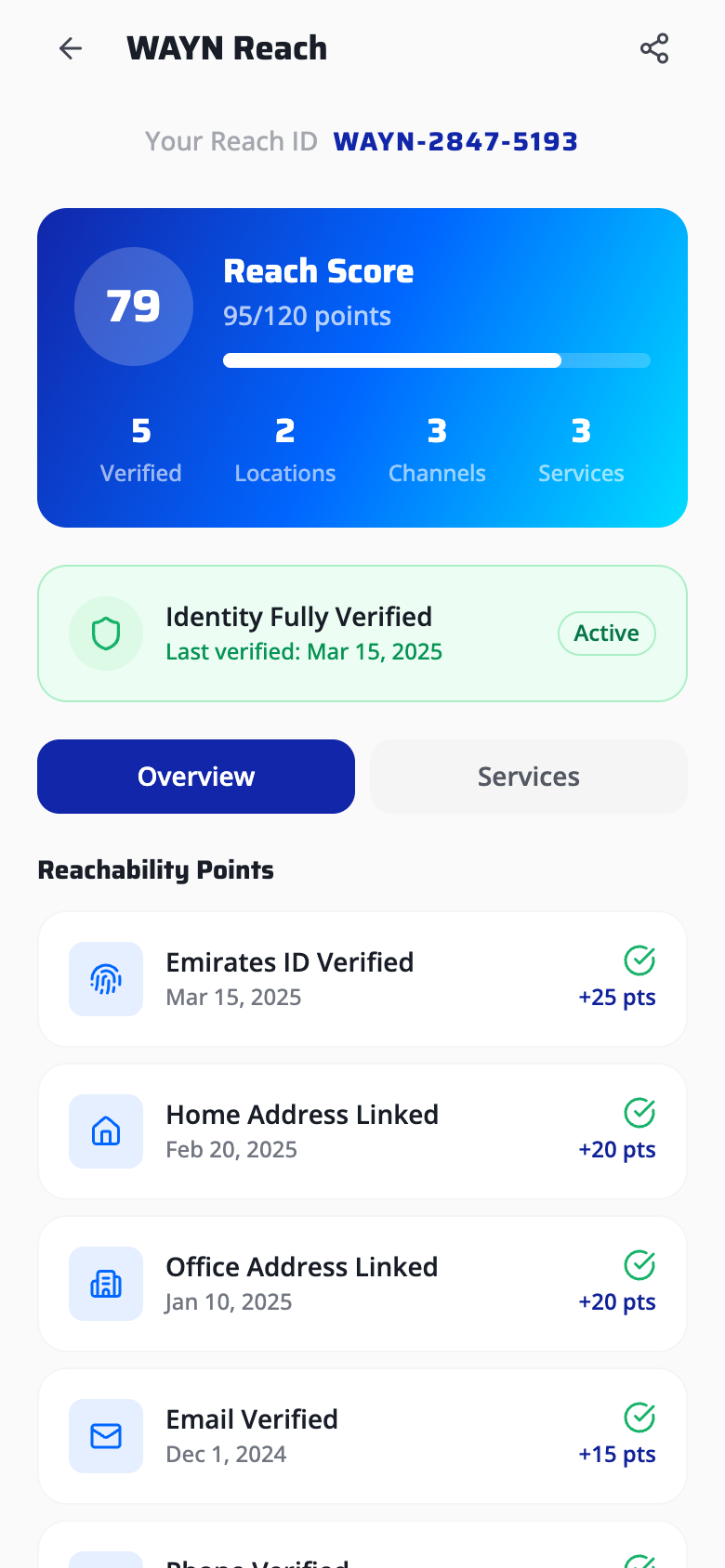
07 - WAYN Reach ID
Gamified identity
Endowed progress effect, Zeigarnik effect, and Gestalt proximity turn identity verification into a completable challenge.
Pre-Loaded Score
Score starts at 79/100, not zero. Nunes and Dreze (2006) showed users given artificial advancement toward a goal are 2x more likely to complete it. The remaining 21 points feel closable - driving action.
Metric Clustering
Four sub-metrics (Verified, Locations, Channels, Services) grouped in a tight horizontal row. Proximity signals "these compose one concept" - users parse the row as a single holistic score breakdown, not four isolated numbers.
Verification Transparency
"Identity Fully Verified" with active badge and last-verified date provides persistent system status. The user never wonders "am I still verified?" - the system continuously confirms trust state.
Incomplete Task Pull
Showing "+25 pts" next to each pending action exploits the Zeigarnik effect - incomplete tasks with visible, quantified rewards create psychological tension that disproportionately occupies working memory until resolved.
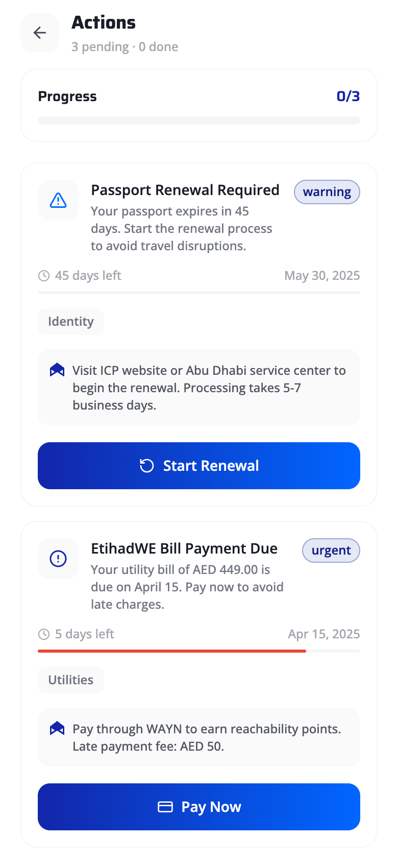
08 - Action Center
Urgency made visible
Pre-attentive color channels, Gestalt continuity, and contextual AI assistance make deadline management visceral.
Completion Ratio
"0/3" progress with bar provides instant system status using a universally understood fraction format. No cognitive translation needed - the gap between 0 and 3 is the user's workload, made tangible.
Color-Coded Severity
Amber "warning" vs red "urgent" badges leverage pre-attentive color channels. Users detect severity level in under 200ms - faster than reading any label. Two-tier color system avoids alarm fatigue from over-signaling.
Progress Bar as Temporal Metaphor
Red fill bar creates directional continuity - the eye follows the bar's trajectory toward "full," mapping spatial extent to time remaining. A near-full red bar triggers urgency without requiring the user to parse dates.
Contextual AI Assistance
WAYN AI recommendation appears inline at the point of need - not hidden behind a help icon. Follows Nielsen's #10: help should be contextual, specific, and actionable. "Pay through WAYN to earn points" is a concrete next step.
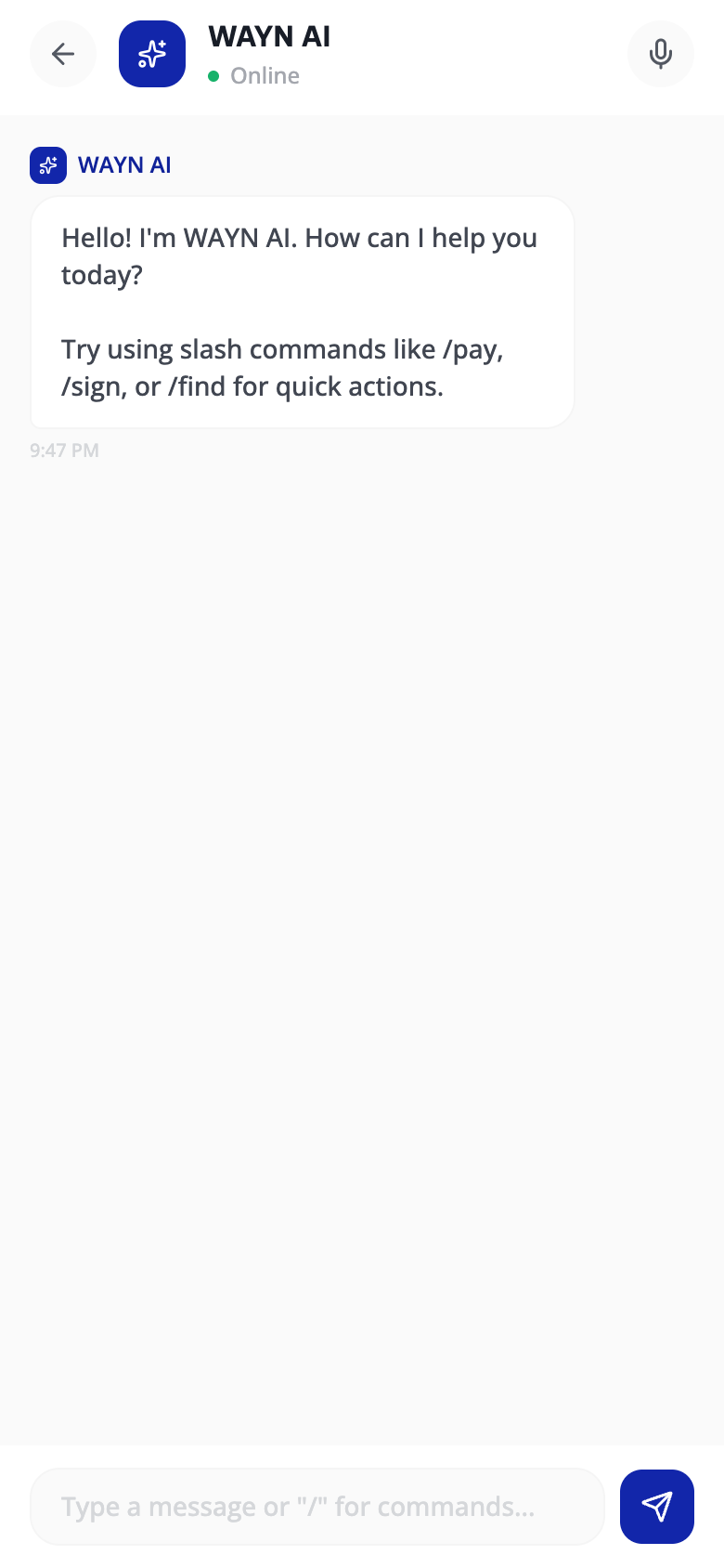
09 - WAYN AI Chat
AI as a first-class citizen
Jakob's Law, progressive disclosure of accelerators, and user control over input modality shape the conversational interface.
Familiar Chat Pattern
Avatar + name + green "Online" dot reuses the mental model from WhatsApp and iMessage. Jakob's Law: users spend most of their time in other apps - they transfer those expectations here. Zero learning curve.
Accelerator Commands
Slash commands (/pay, /sign, /find) are expert accelerators invisible to novices - revealed through the AI's own onboarding message. Progressive disclosure of power features: simple for beginners, efficient for power users.
Modality Freedom
Voice toggle gives full control over input mode with no context loss on switch. Users choose text, voice, or slash commands based on situational context - the system never prescribes a single interaction path.
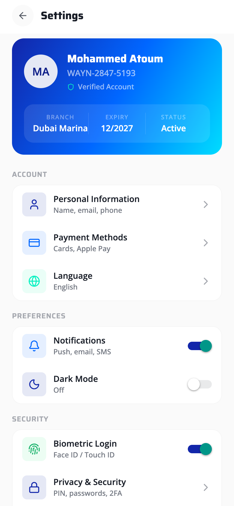
10 - Settings
Profile as a hero card
Aesthetic-usability effect, consistent affordance mapping, and safe defaults create a settings screen that builds trust.
Identity as Premium Card
The gradient card triggers the aesthetic-usability effect (Kurosu and Kashimura, 1995) - aesthetically pleasing interfaces are perceived as more usable and trustworthy. Users feel their identity is handled with care.
At-a-Glance Metadata
Branch, Expiry, Status rendered in a single compact row. All critical account metadata is recognizable without navigation - no recall required to answer "when does my account expire?"
Consistent Affordance Mapping
Toggles exclusively for binary on/off settings; chevrons exclusively for drill-down pages. This 1:1 mapping between control type and interaction outcome is maintained across every screen in the app.
Secure Defaults
Biometric Login ships ON by default - the paved road pattern. The safest option requires zero effort; opting out is possible but requires deliberate action. Security through the path of least resistance.
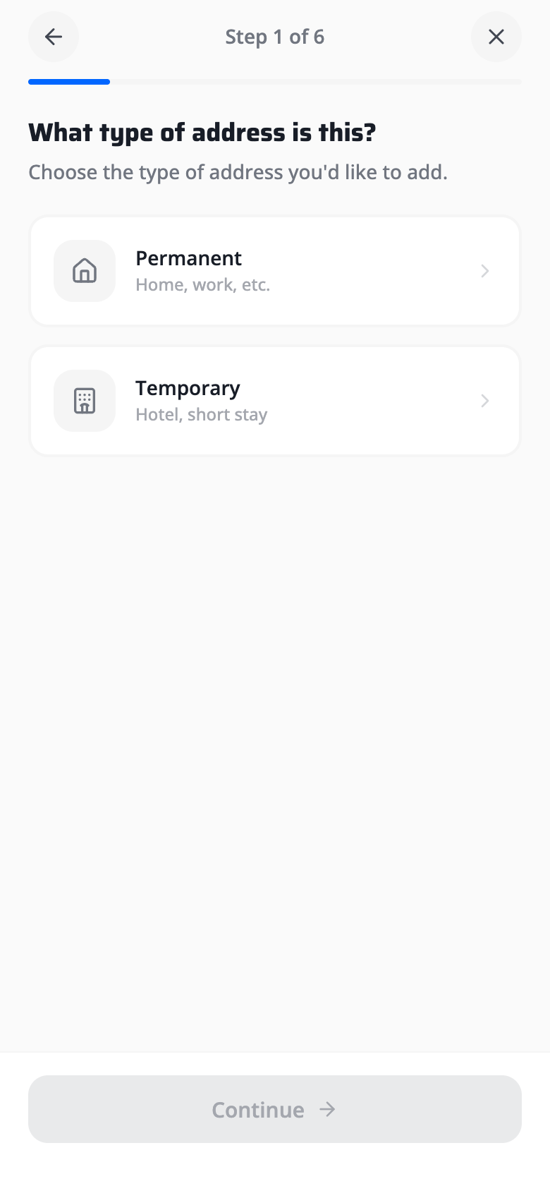
11 - Add Address Wizard
6-step guided flow
Dual-encoding visibility, Hick's Law, and progressive disclosure eliminate form fatigue across a multi-step wizard.
Dual Progress Encoding
"Step 1 of 6" text plus a proportional fill bar encode progress in two channels simultaneously. Redundancy ensures visibility whether the user reads text or scans visually - reducing uncertainty in a long flow.
Binary Choice Cards
Permanent vs Temporary as two large cards: Hick's Law predicts near-instant decision time with n=2. Large card targets replace dropdown menus, trading vertical space for dramatically better mobile tap ergonomics.
One Decision Per Step
Each wizard step isolates a single decision (type, location, details). Progressive disclosure ensures cognitive load never exceeds one choice at a time - six simple steps feel lighter than one complex form.